Botanical Brand Identity & Print Design for Clover.
Approach & Delivery
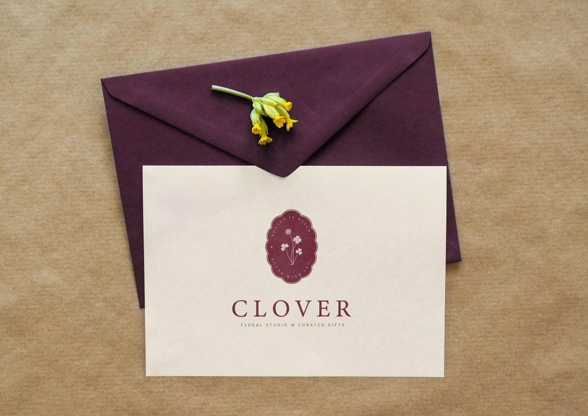
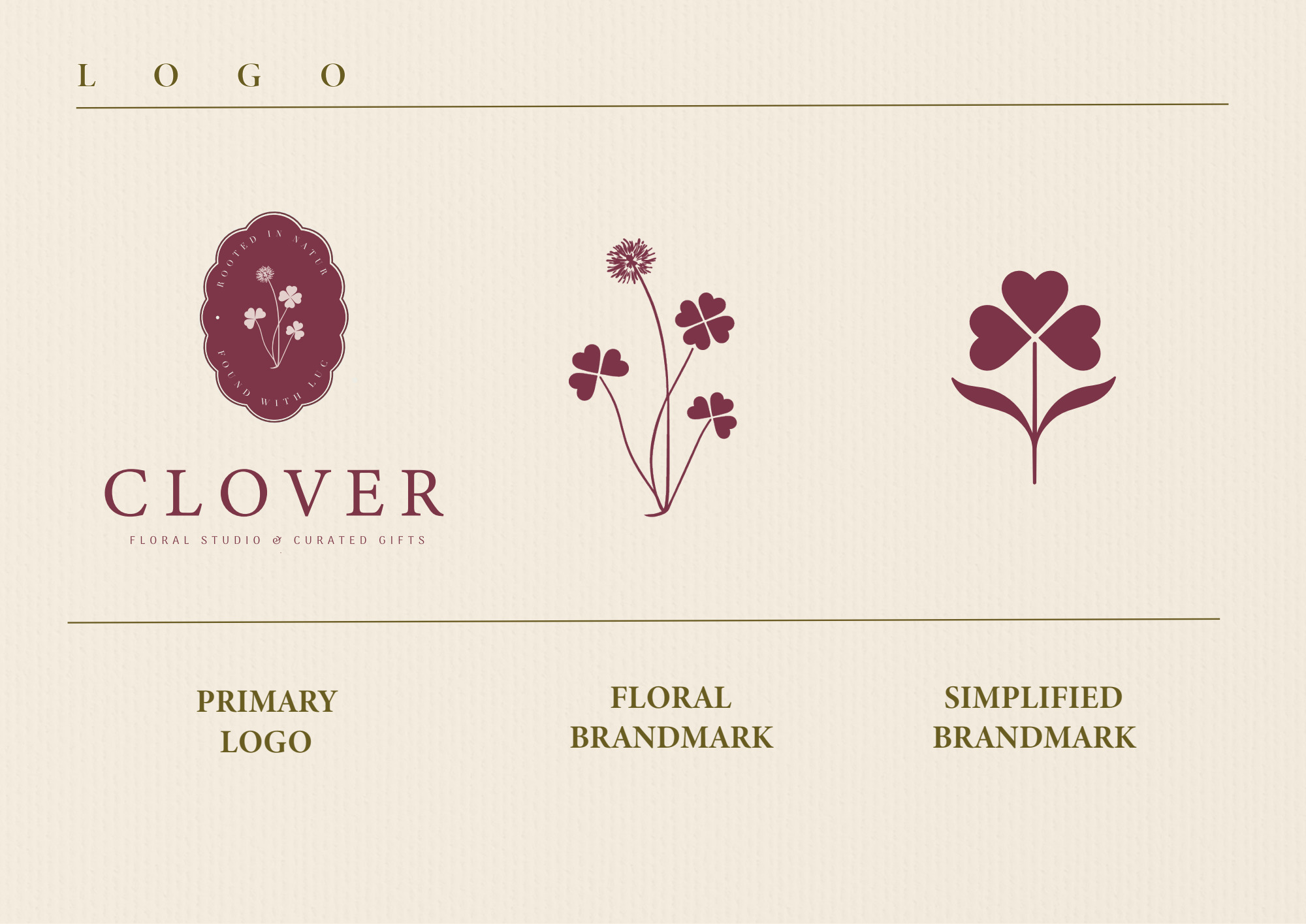
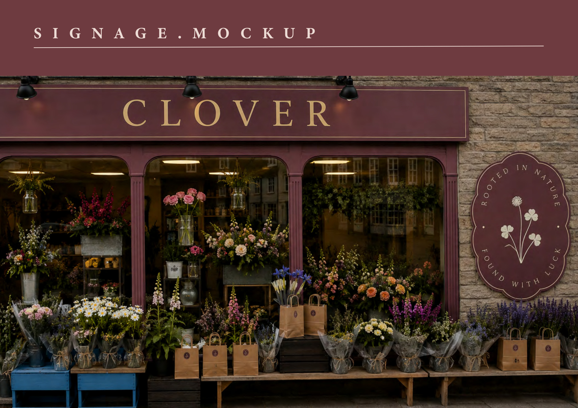
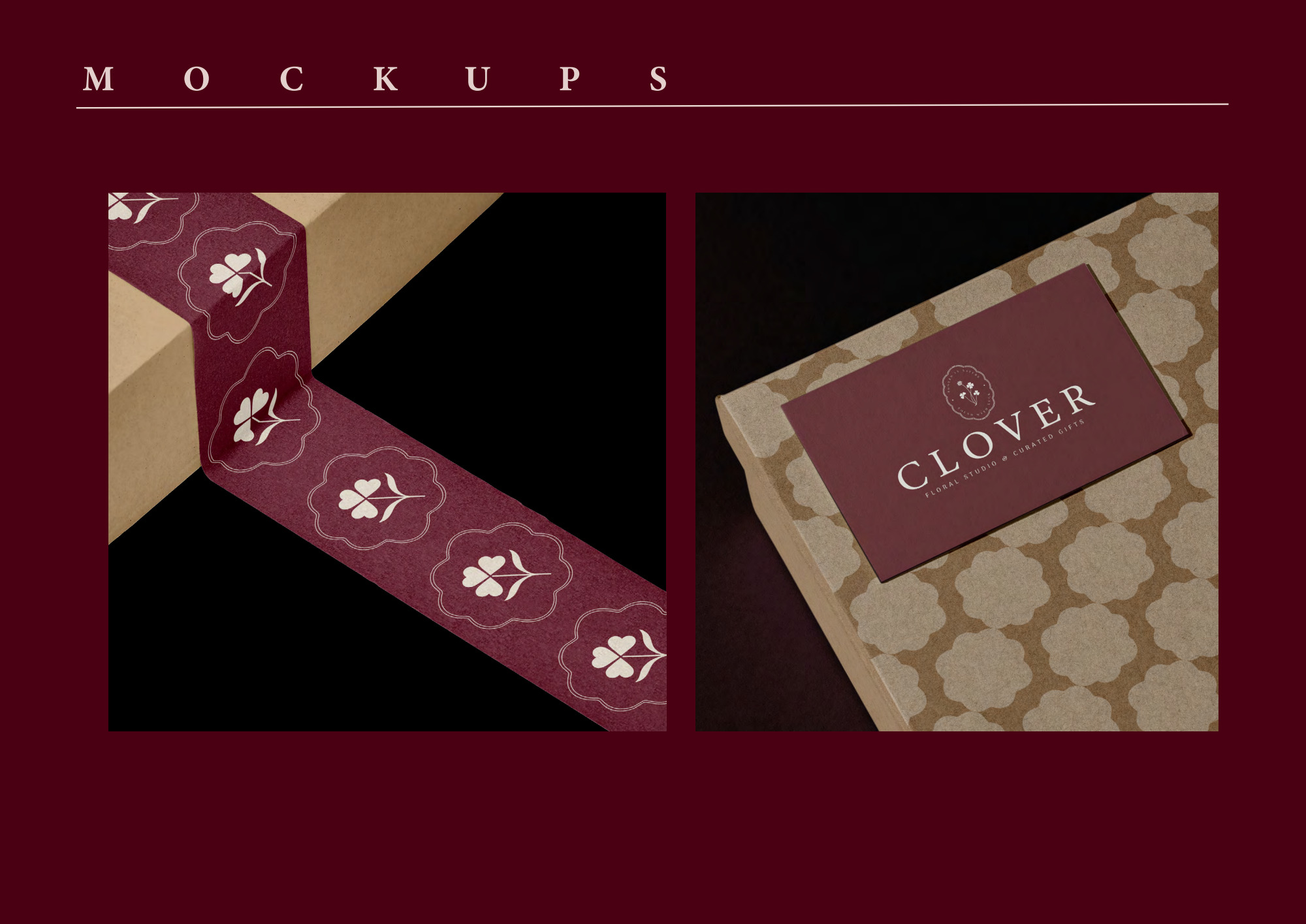
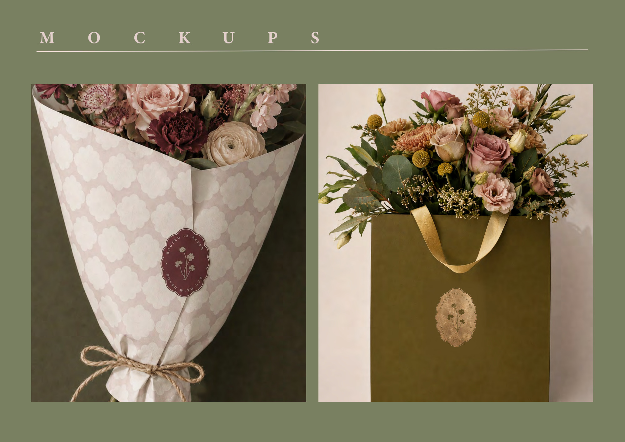
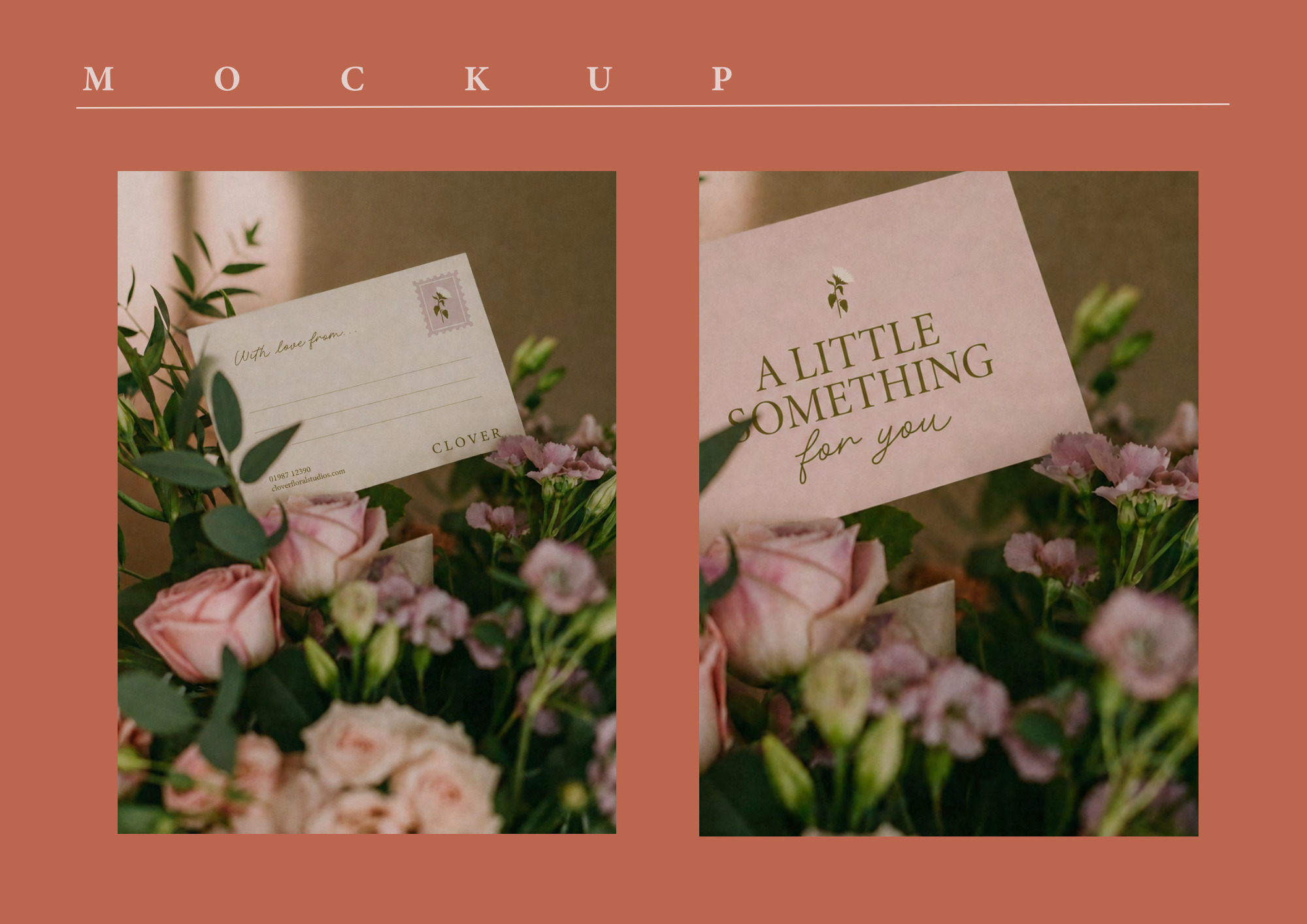
The identity pairs a serif wordmark with a floral badge, an illustrated brandmark and a simplified clover symbol. Burgundy, cream and muted botanical colours sit alongside expressive script accents and patterned backgrounds, giving the designs a warm, consistent character. The guidelines set out the logo family, colour palette, typography, backgrounds, patterns and seasonal icons. Print designs carry those elements into stickers, business cards, A6 flower-care guides and A7 bouquet cards. Signage and packaging mockups show how the identity can work across a shopfront, labels, ribbon, wrapped flowers and gift bags.
Design outcome
A connected collection of brand and print designs, with a recognisable visual language across the applications. The shared marks, colours and botanical details give each piece a place in the same identity, from a small bouquet card to a shopfront mockup.