You've invested in a shoot. The images are clean, well-lit, professionally edited. You've uploaded them to your website, seeded them into your ad campaigns, pushed them across social. And then -not much happens.
This is the most common frustration we hear from food and hospitality brands, and it's one of the most misdiagnosed. The instinct is to blame the photography: the resolution, the styling, the shot selection. But in almost every case we've encountered, the images themselves are not the problem.
The problem is that the brand is collecting pretty pictures instead of building brand assets. And in ecommerce, those are not the same thing.
A pretty shot is about the subject. A brand asset is about the customer.
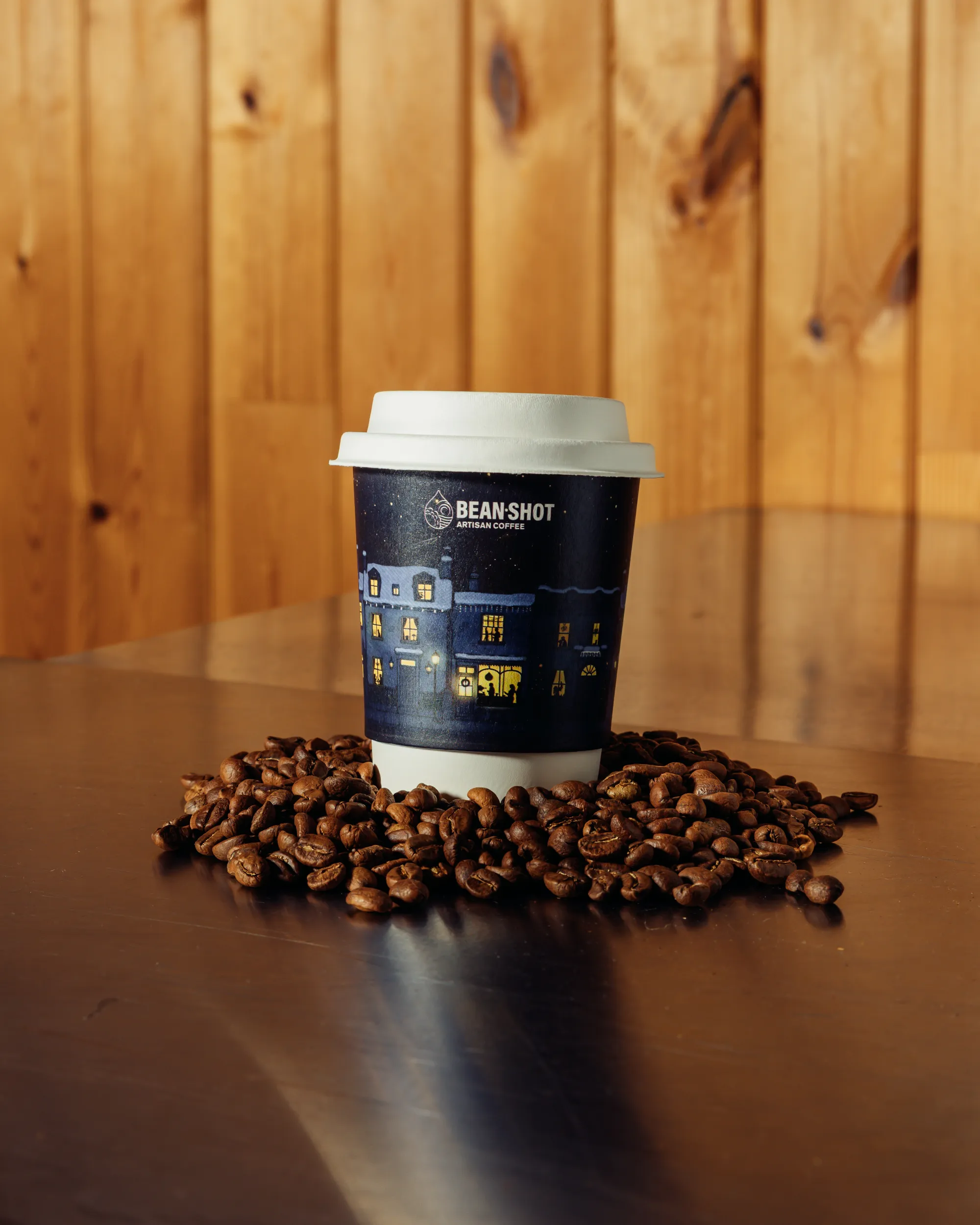
Pretty shots make food look appetising. Brand assets make a specific customer feel something - and then act on it. That distinction sounds simple, but it changes every decision made on and before a shoot: what's in the frame, how it's lit, how it's edited, where it sits on the page, and what it sits next to.
A useful shoot starts with a clear brief, a defined audience and a specific commercial purpose.
The brief is where most shoots go wrong - long before anyone picks up a camera
When a food or hospitality brand comes to us with imagery that isn't performing, we rarely need to look at the images for long. We look at the brief. And more often than not, what we find is something like: 'make it feel premium' or 'warm tones, natural light, artisan feel.'
These aren't briefs. They're aesthetic preferences. And while there's nothing wrong with having them, they don't tell a photographer what the image needs to do - which means the photographer is filling in the gap with their own instincts.
The result? Images that are technically competent, visually pleasant, and completely generic. Images that could belong to any brand in your category.
For hospitality businesses, images can help people decide whether to book. The brief should account for the menu, setting and booking journey.
What a brief actually needs to contain
A proper pre-production brief is not a mood board and a Pantone swatch. It answers five questions with specificity:
Who is seeing this image, and where? A hero shot for a Shopify PDP behaves differently to a story asset for Instagram Reels, a press image for a trade publication, or a paid social creative. The crop, negative space, text placement, and motion considerations are all different. Treating them as interchangeable is one of the most common - and costly - errors we see.
What decision are we trying to influence? Buy now. Add to basket. Book a table. Subscribe. Click through. Each requires a different visual register. An image optimised to build brand trust looks different to one optimised to close a transaction. Both have value; they just aren't the same image.
What does this brand own, and is it visible? Provenance, craft, humour, simplicity, indulgence - whatever the brand's equities are, the imagery needs to embody them, not merely reference them. Showing a jar of chutney on a wooden board suggests 'artisan.' Showing it in context - on a cheese board at dusk, with the right typography and a story behind it - builds a brand.
What is the competitive visual language - and how do we differentiate from it? Most food brands in any given category have converged around the same aesthetic: the same dark slate, the same white linen, the same sprigs of thyme. A great brief asks: what does standing out actually look like in this context?
What does conversion look like for this specific asset? This is the question almost nobody asks. If a product page image lifts add-to-cart rate by even 5%, that's measurable value. If it doesn't, it's decoration. The brief should define the job, so the shoot can be evaluated against it.
The compounding cost of getting this wrong
Most brands absorb the cost of poor visual strategy silently. The photography looks fine, so the problem gets attributed elsewhere: the product, the price, the platform, the algorithm.
For food bought online, customers cannot taste the product before buying. Images should show the product clearly and help set realistic expectations.
There is also a brand equity dimension that rarely gets quantified. Inconsistent or undifferentiated visual content erodes the very thing food brands need most: trust. Trust is built through coherence - through a visual identity that is consistent, specific, and recognisably yours.
What good looks like - and what it produces
When the brief is right, everything on the shoot changes. Every decision - the surface, the light, the props, the talent, the angle, the timing, the edit - is made against a clear standard: does this serve the person we're trying to reach, at the moment we're trying to reach them?
The result isn't always the most dramatically beautiful image. It's the image that works. That stops someone mid-scroll. That makes a product feel worth its price. That makes a restaurant feel like somewhere you'd actually want to be tonight.
That's the difference between a portfolio piece and a brand asset. A useful brand image serves the audience, format and purpose set out in the brief.
A well-briefed visual library can help a brand repurpose content and maintain consistency. Whether it reduces costs depends on how widely and how long the images can be used.
If your current photography isn't performing, the conversation doesn't start with the images. It starts with what you asked them to do.
We work with food and hospitality brands to make sure that conversation happens before the shoot - not after. Get in touch.
By Antoine at The Artist Studio Updated 9 October 2026.
Explore our commercial photography and video services and website design services to see how imagery and the customer journey can be planned together.